I love graphs.
Actually, I love working with numbers, formulas and statistics, and I often present these numbers, formulas and statistics to others. By “others,” I mean co-workers, board members or just interested parties. Anyone really. I don’t discriminate (and neither do numbers). What I’ve found, though, is that these other parties may not share my love of numbers, formulas and statistics. Thus, my love of graphs.
Graphs help me explain my numbers, formulas and statistics in a visual way. They’re a great way to simplify often overwhelming or complicated information into something that can be easily digested and understood.
If they are used correctly.
Unfortunately, many people use graphs incorrectly. See, a graph should relay your point quickly—a mere glance should do the trick. If people have to study and analyze your graph, you’ve failed.
Because of my love of graphs, I gravitate towards them and notice (quickly) when the information is not presented correctly. This is really a pet peeve of mine (even worse than when that driver puts on a turn signal but then doesn’t turn—epic misuse of the signal). See, different types of graphs have different uses. Want to learn more? Of course, you do! Here is a quick summary of several types of graphs and their use cases:
Line Graph
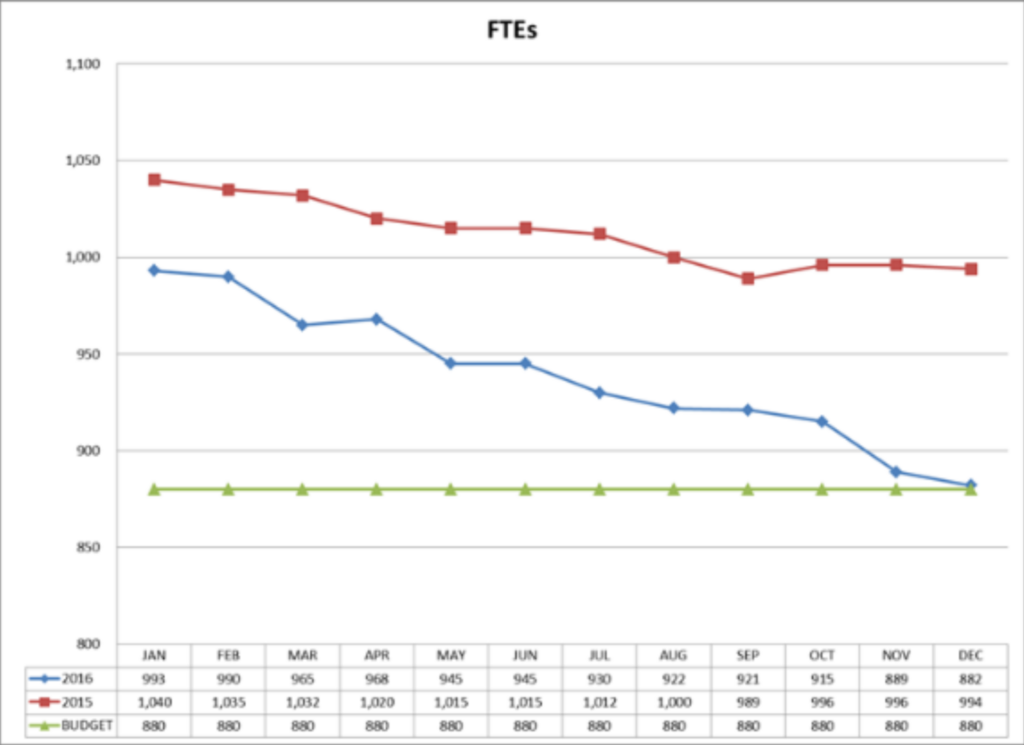
- A line graph is used to track changes over time. A line graph is a good way to show trends. Monthly net income or operating gains and losses over time, for example, are good to track on a line graph.
Bar Graph
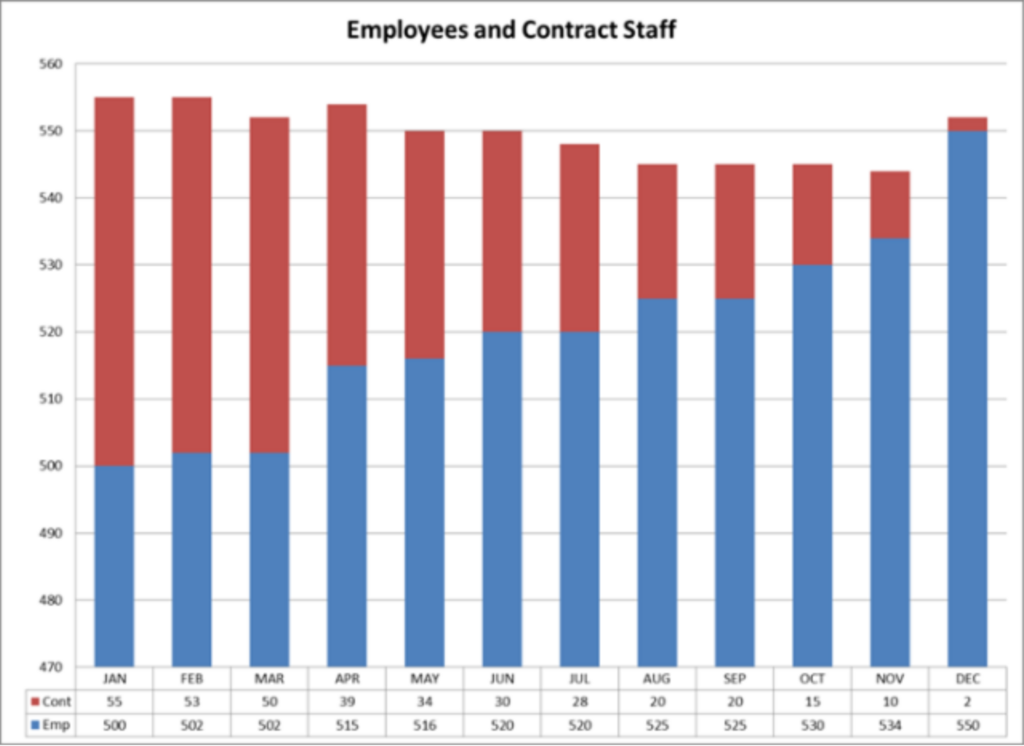
- A bar graph can also be used to track changes over time (and trends). But bar graphs have the additional power to compare different items. Examples of bar graphs would be actual sales compared to budgeted sales or sales over time.
Pie Chart
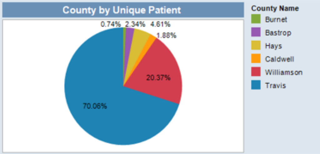
- A pie chart is used when comparing parts of a whole. That means that the parts must add up to 100% (or the total amount, if you aren’t using percentages). This is because the circle indicates “the whole” thing. Revenue sources (which would add up to total revenue) would be shown in a pie chart, for example.
Things to keep in mind when using graphs:
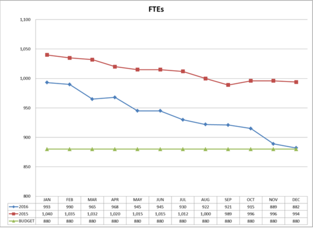
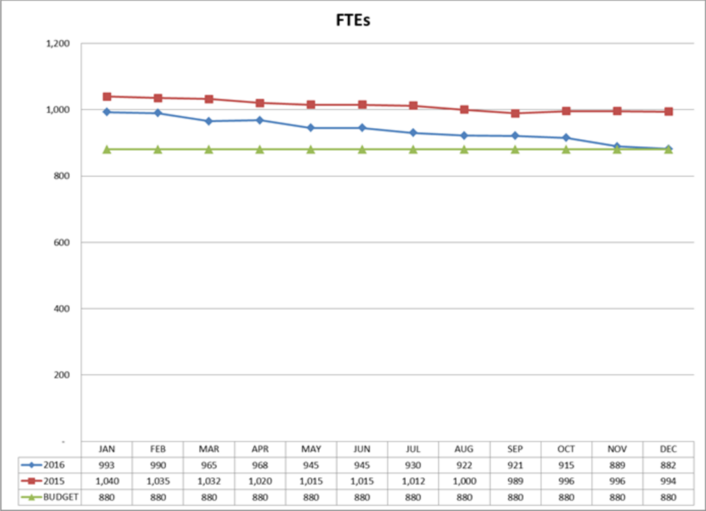
When using graphs, you also need to be aware of the axis or scale of the graph. Changing the scale of a graph can change the meaning or point you are trying to make. For example, both line graphs below show the same information: the number of FTEs (Full Time Equivalent staff) by month. You can clearly see a downward trend, yet the graph on the left shows a more prominent decline. The only different is the scale (which is found on the y-axis). By simply changing the scale, you change the meaning of the graph.
In another example, the following two graphs show the mix of employee staff versus contract staff on a monthly basis. Again, the only difference between the two graphs is the scale or y-axis.

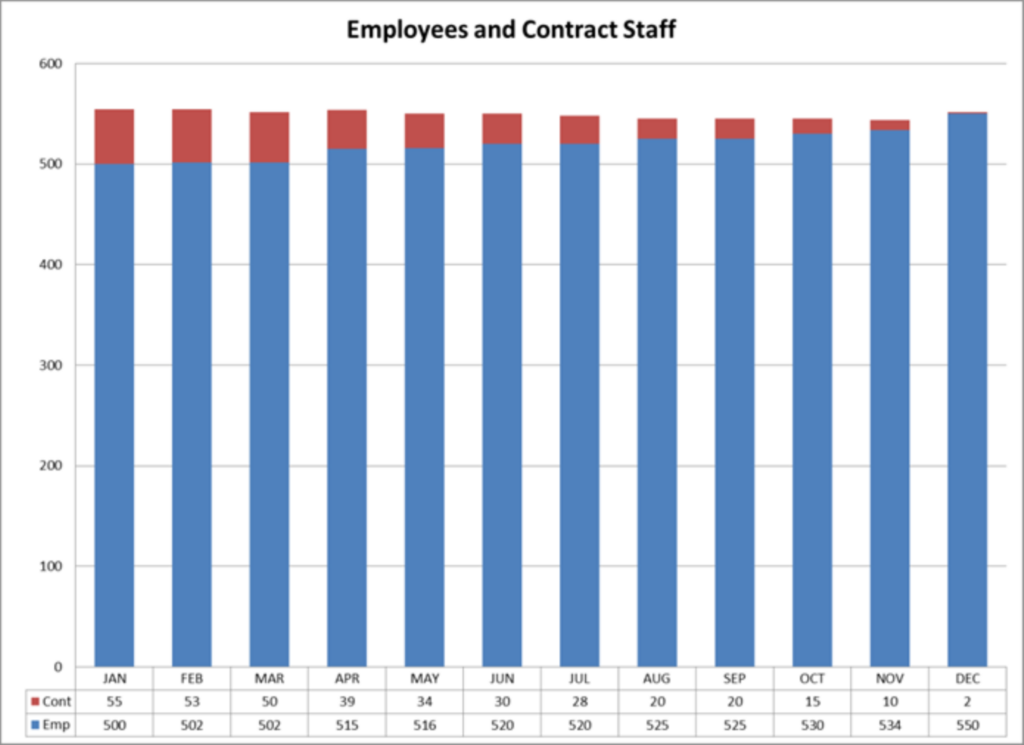
Which graph would be better to make a point? Which graph shows the information quickly, at a glance?
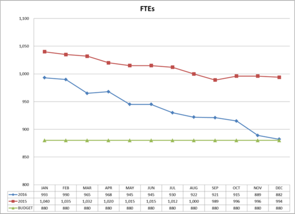
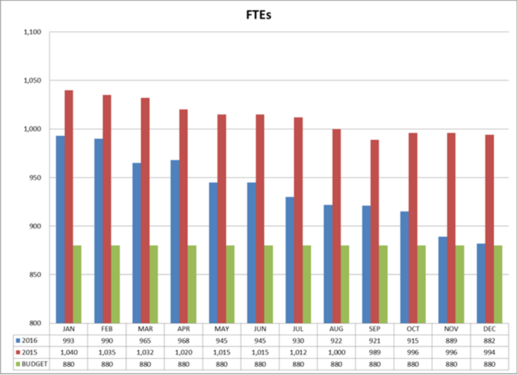
The two graphs below both show the same information. They both show FTEs (Full Time Equivalent staff) for two different year compared to the budget. Which one do you think shows the trend as compared to the budget the best?
Graphs can be great tools for conveying information, if used correctly. Or they can become someone’s pet peeve.